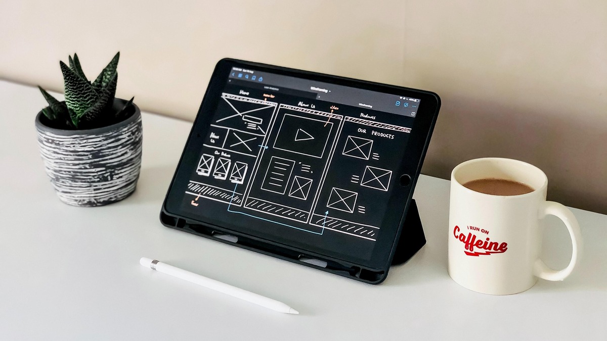
You’ve picked a domain name – preferably one that’s short and easy to spell – you’ve registered it and you’re ready to start building your site.
But you’re no designer and you don’t have the budget to hire one. So, what are the essentials you need to know to build effective pages that help you build credibility and bring in new customers?
Here are some key elements small businesses need to consider when designing a website.
Style and legibility
Let’s start with the basics. Your website needs to be visually appealing for your target customers. If you’re selling street wear you might want an urban look and if you’re a bookkeeper, you’ll want a professional, responsible look. But whatever style you choose, your website needs to be easy to read.
Choose a user-friendly font – While your font style should align to your brand and appeal to your target audience, if your font is so stylised that it’s difficult to read, customers are likely to disengage.
Colour for clarity – Stick to a limited colour scheme and use it consistently across your site. For backgrounds behind text, use solid contrasting colours and avoid the use of textures or patterns, which can make it difficult to read. Black text on a white background is best for legibility, but another light block colour with dark text also works well. To help build recognition, stick to your brand colors and implement the same color scheme across your site and throughout your marketing materials.
Good quality images
Use high quality accurate product photos. Consumers want to see the most detail possible, but they also want the images to load fast. A good rule of thumb is to aim for the smallest file size that still provides optimal image size and resolution.
Products should be featured singularly as standalone images first, showing multiple angles, details, features and benefits before any lifestyle images of the product in context with other elements are shown. If your product requires it, consider showing the scale or size of the product.
With the right images, you can make your products stand out and make viewers stop and stare.
Keep your site navigation easy
Good website navigation is designed with the user in mind and uses clear, easy-to-understand language and links to the most important pages. Before you even start writing content for your site, it’s a good idea to plan out your page structure and how your navigation will work. Also with 79% of Australians now shopping on their smartphones, a responsive/mobile-first approach to navigation is a must.
This means designing your navigation elements to work well on a small screen by keeping labels as short as possible while still communicating clearly, and limiting the number of options on your menu so users don’t have to scroll.
If your navigation must include more items, a vertical list is best rather than having users scroll horizontally. Finger size and hand positioning also need to be taken into account. Nobody wants to waste time trying to tap a tiny icon and not being able to get anywhere. This means your links and buttons need to be big enough for most people to be able to tap successfully on the first try – even if they’re tradies with big fingers!
Provide a smooth checkout experience
A smooth and trusted checkout experience is important to help drive sales. Seventy percent (70%) of Australians have abandoned a cart before completing checkout.T he two top reasons include security concerns (41%) and preferred payment method not being available at checkout (36%). These types of cart abandonments could be prevented by offering secure payment methods that people use and trust. In Australia, PayPal is the most used, most preferred and most trusted online payment option1 and consumers are 2.6 times more likely to purchase when PayPal is offered.1 The next most-trusted online payment options are credit cards and debit cards.1
Additionally, offering a pay-by-instalment option, such as buy now pay later (BNPL), can help improve conversion. There are BNPL options that have no interest and no late fees for consumers, such as PayPal Pay in 4. For businesses, there is also no additional cost for PayPal Pay in 4 beyond their existing account arrangements and it requires no additional integration as consumers access the service via their PayPal account.
Include reviews
Most customers are now expecting to see reviews, and if you’re not including these your business is already a step behind. Reviews, also known as testimonials, proves credibility of your products and services.
Ratings and reviews can also help to raise the profile of your business in listings, so always encourage customers to leave reviews on the website and send follow up emails for feedback post purchase. This will also help build rapport with your customers and get genuine feedback.
Be easy to find
Leveraging search engine optimisation (SEO) for your small business can further build credibility. SEO can help businesses rank higher on search engine result pages. This can be achieved through optimising your website around specific keywords, site structure, and image descriptions to achieve stable, long-term traffic.
Tips for implementing a strong SEO strategy include:
Using long-tail keywords to reach customers
A/B test specific keywords and messaging
Using natural language in your SEO strategy
Including keywords in video titles and descriptions
Regularly updating blog content for better SEO
More than ever, having a strong online presence, particularly a website, can be make or break for generating revenue. It increases credibility, showcases your brand, helps to generate new leads and can be an important factor in driving great customer experience.
Keep up to date with our stories on LinkedIn, Twitter, Facebook and Instagram.
Here are the essential elements for your small business website: Expert, Design Dynamic Business


